


Glasun
Graphics for wine labels
Castel Frères
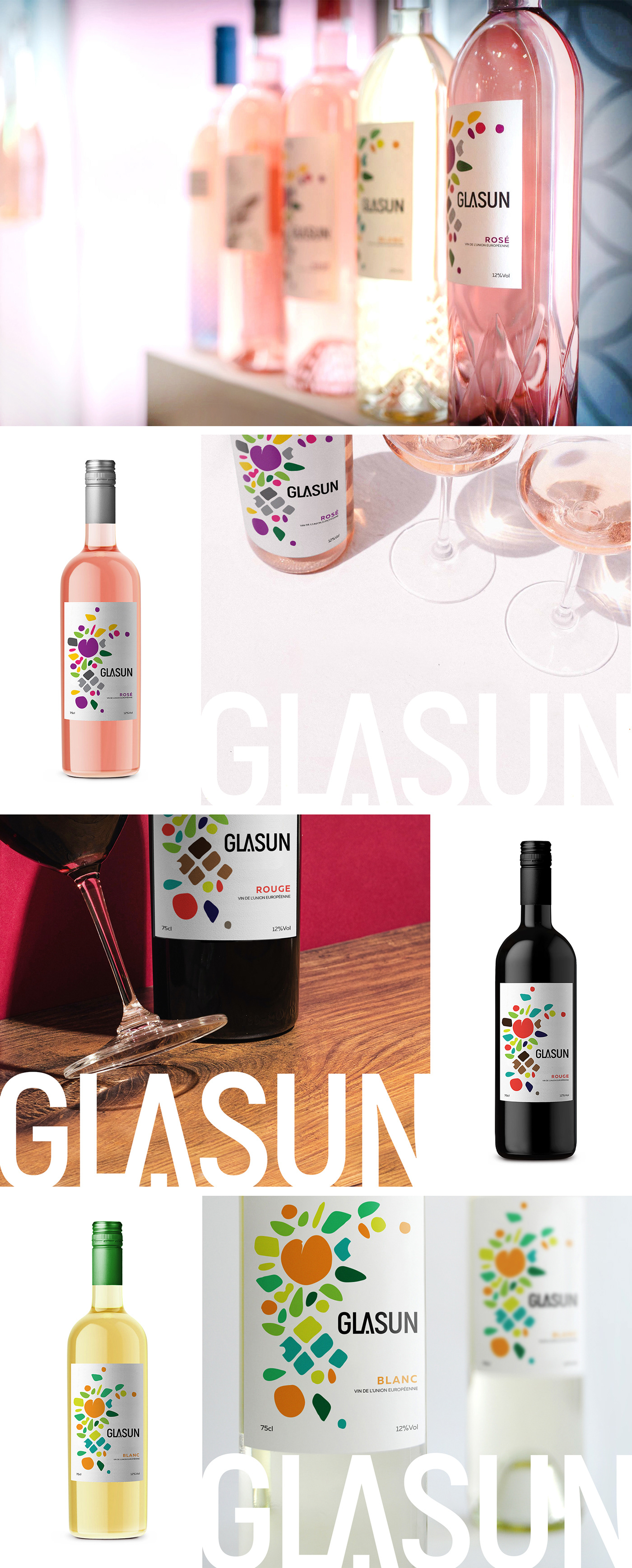
Glasun is a new wine brand of CASTEL FRERES, series of three wine blends – Rouge, Blanc and Rose. To pair with each blend they wanted creative and offbeat label designs that establish them as visually unique as their wines. A new line of wine from European countries accessible to young consumers that makes wine simple. An easy-drinking wine for newbies with a very impacting and attractive packaging. Тarget audience, men and women from 20 to 35 years, mass consumer. Feminine, loud, playful, minimalistic and casual.

The illustration represents abstract natural forms – fruits, leaves and seeds, corresponding to the flavors of the wines. Each of the blends is shown by a different combination of colors which best speak for the character of the wine.
The trademark is typographical. The main attention of the consumer is grabbed by the illustration (the distinctive brand pattern). The visual language of communication is friendly and fresh. Easy design system, allowing the manufacturer to add more blends to the series.

Because the drinks are intended for a younger audience, I bet on an approach that attracts attention immediately - colorful and signal. Light and party vision for an Open Air festival or for a summer outdoor party with friends.
Package dimensions
Width: 10 mm max. Bottles should be three different colors for each blend - black, transparent and lightened yellow. Branded screw caps for each bottle - green, black and silver.
Front label of 250g structural paper with dimension - 75x119 mm and contra label of 250g structural paper with dimension - 60x85 mm.


